Tile of Spain Passport to Creativity: Tile Trends Spotted at Cevisama 2023

Reolonda product collections offered a spectrum of textures, finishes and colors, ranging from watery blues to crisp greens to bright whites.
The Tile of Spain Passport to Creativity Tour was a feast for the eyes. Vibrant colors, nature-inspired patterns offset with textural elements, and technological advancements were just a few of the trends spotted at Cevisama 2023.
Each year, Tile of Spain selects a group of designers, architects and members of the media to travel to Valencia, Spain, to explore the Old City’s architecture and history, learn about the ceramic tile manufacturing process and view the latest in tile products and trends at the Cevisama ceramic tile tradeshow.
Before the pandemic, consumers desired neutrals upon which they could pair bright, patterned or highly textured accent pieces. During the pandemic, when consumers spent inordinate amounts of time at home, they craved more color and connections with nature. Enter a shift in tile design.
This year, the Spanish tile industry has taken tile trends up a notch. The trends that were so popular last year—color and influences of biophilia remain; however, through enhanced digital printing technology, those products are more vibrant and realistic than ever. This technology has also made it possible to combine color, textures and patterns in ways that were not previously possible.
Digital Printing Realism
Digital printing on ceramic tile has come a long way. Tile manufacturers are now capable of printing stone, wood and concrete visuals that are impossible to tell apart from the real thing.
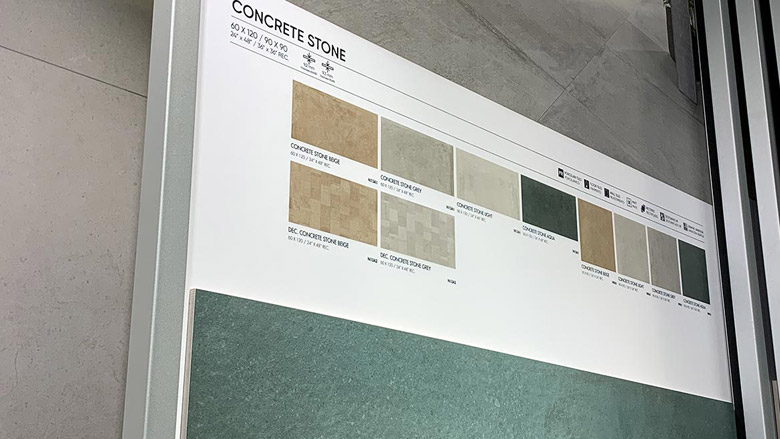
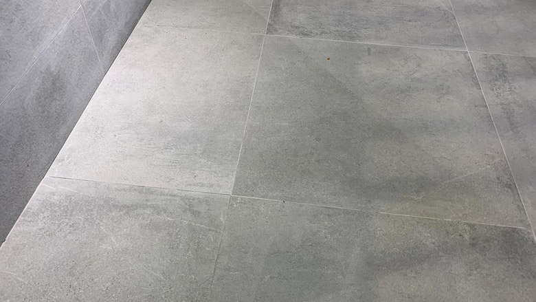
Ceramica Fanal’s Concrete Stone collection is an example of what’s capable with the latest digital printing technology when it comes to creating stone and concrete looks.
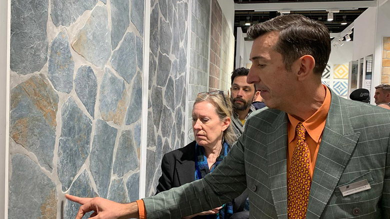
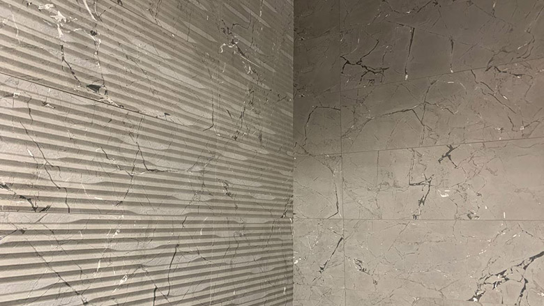
Real stone or faux? Cerlat’s Motesa-M collection.
Digital printing is being used to create superimposed wallpaper looks over stone, marble or concrete. This looks very similar to what is referred to as “double exposure” in photography. Double exposure is when two images are exposed twice to create a single image and can easily be done within platforms like Adobe Photoshop to digitally create artistic images.
The tile itself is printed with a stone or concrete visual and overlayed with another element like leaves or a floral pattern. In some cases, a third element is transposed over top of the first two to create a three-dimensional effect.
According to Ryan Fasan, U.S. technical consultant, Tile of Spain, this “double-exposure” technique has only been utilized in the design of tile within the last year.
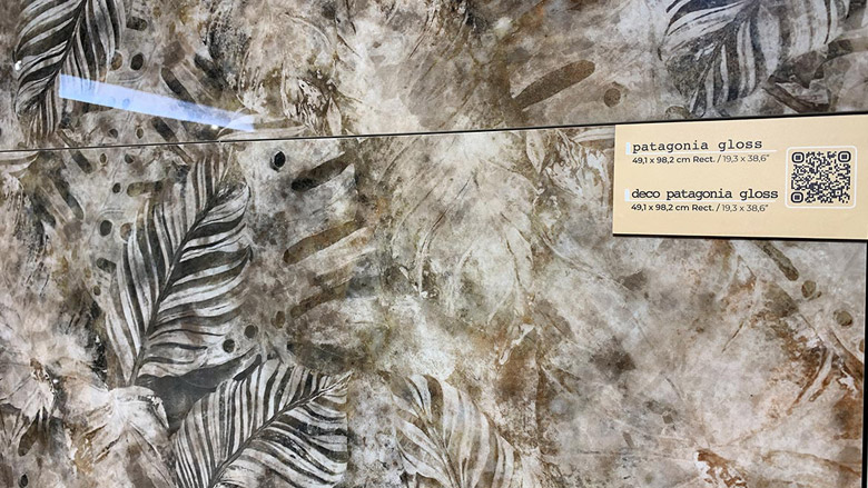
This high-gloss tile by Ceracasa overlays a tropical leaf pattern onto an earth-toned marble look.
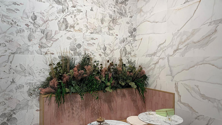
Keraban Group’s Ibero brand showcased a nature-inspired pattern with leaves and flowers visible on top of white marble with another white floral pattern transposed across the tile.
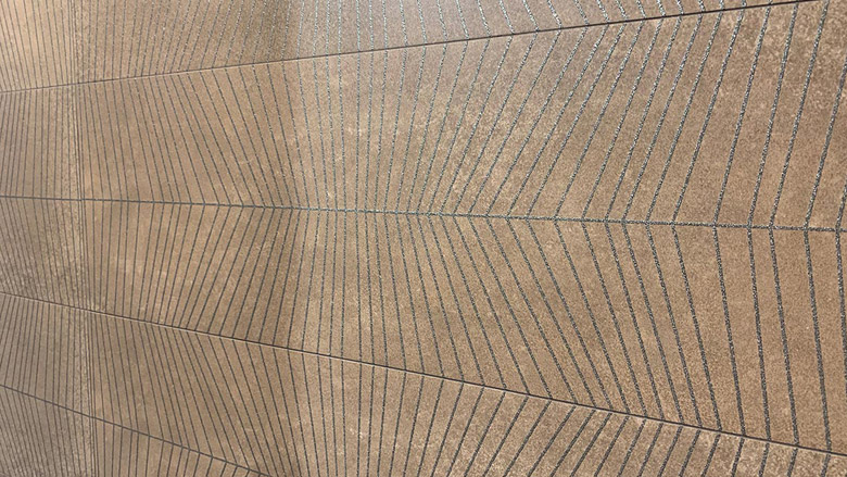
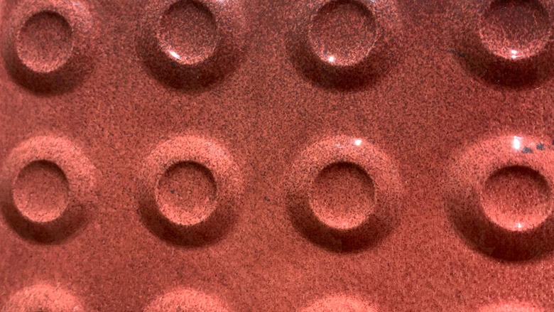
Taking Texture to the Next Level
Third-fire decoration is a technique used to create highly textured design features or adornments on tile. Third-fire decoration can take any form such as a line, shape or pattern. It can work solely as an accent or create an entire patterned design. This technique was present in a number of products at Cevisama, but the best example was found in the Keraban Group’s Ibera collections.
“Third-fire decoration is always voluminous and usually iridescent or metallic,” Fasan said. “It’s generally done on wall tiles, which are almost always fired once for the biscuit and a second time for the glaze. Wall tile glazes are often brighter, glossier and more vibrant than can be achieved at the temperatures required to winter a tile body (biscuit), so they glaze them after firing and fire again at a lower temperature. Third-fire effects are even more delicate than standard glaze and in the case of metallics, must be fired in an oxygen-starved environment, so they get applied after the glaze is fired and then fired again at an even lower temp to harden.”
Keraban Group’s Ibero brand displayed a marbled stone look with a black, metallic third-fire decorative pattern.
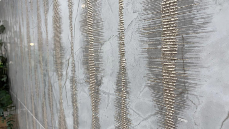
An example of a gold, metallic strip third-fire pattern, mimicking sound waves, atop a veiny marble slab.
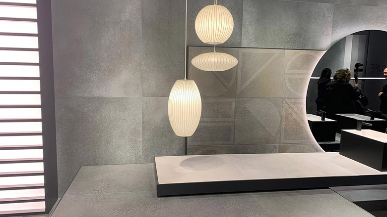
ASCER, the Spanish Tile Manufacturer’s Association, and Tile of Spain listed wellness as a top trend for 2023, citing our need to re-evaluate our daily habits post-pandemic. The focus remains on the need for self-care, a reduction in stress levels and mood boosts, and the home has become the principal space for healing.
The manipulation of textural elements along with the intentional use of color come together to create spaces that elicit feelings of calmness and serenity. The surface finish also plays a huge role in creating the desired effect. According to ASCER and Tile of Spain, it is important to utilize products that offer “hyper-tactile, satin, matte and porous finishes” as part of creating wellness-centric spaces.
Arcana Ceramica showcased its Cliff Collection that is a stone look in solid, geometric and scalloped wall and floor tiles tinted with a Jade color. The combination of the textured stone and the subtle green hue create an atmosphere of calm.
Celebration of Color
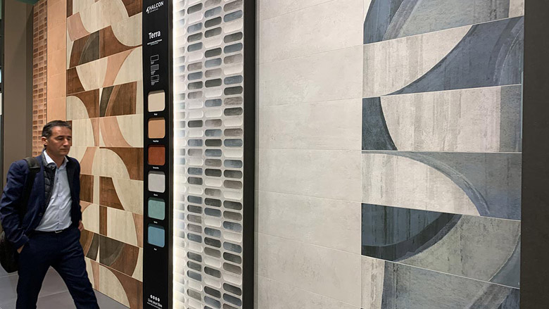
This year creating an abundance of color options and patterns to choose from is top of mind for manufacturers. Colors are mixed and matched with extravagant patterns that in the past would have been too bold and busy. Wallpaper patterns with a spectrum of colors are popular on the floor and wall as is the use of monochromatic looks mixed with metallic visuals.
While blues and greens remain at the top of the list especially in watery blues and soothing greens, Pantone set the stage for the entrance of vibrant colors with its 2023 Color of the Year, Viva Magenta. Bright pinks, oranges and yellows are being used in eye-catching patterns, floral designs and as bold accents for monochromatic looks.
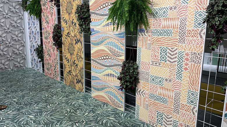
Ceracasa’s Couture and Chroma collection blends color and shapes in bold ways.
The combination of Ceracasa’s monochromatic visuals and geometric shapes is the perfect palette for a pop of orange color.
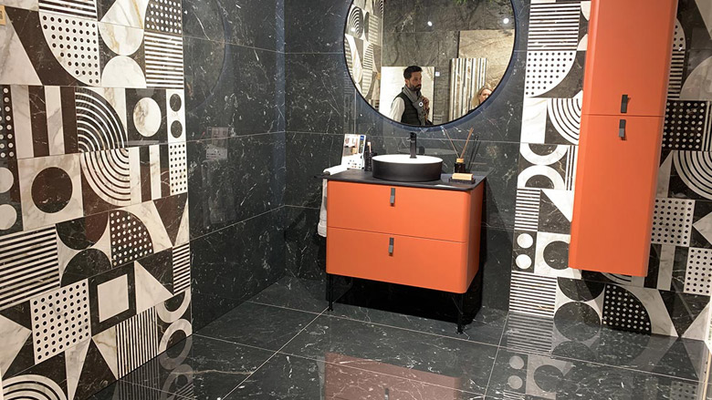
Vives bathroom vignette is an example of the intersection of bold color use and various textural elements.
Looking for a reprint of this article?
From high-res PDFs to custom plaques, order your copy today!


